


Founder & Co-director
Founder & Co-director
Year
'18 - 2026
Client
Take Two
Service
Brand & Business Development
Brand & Business Development
Interior & Furniture Design
Creative Direction
Graphic Design
Year
'18 - 2026
Client
Take Two
Service
Brand & Business Development
Brand & Business Development
Interior & Furniture Design
Creative Direction
Graphic Design
TakeTwo is a Melbourne bagel shop known for its hand-rolled New York-style bagels, quality coffee and relaxed local energy. Since opening in 2018, the brand has built a strong reputation around fresh food, approachable service and a playful hospitality experience. The project focused on shaping a more distinctive and cohesive brand presence across digital, print and physical touchpoints, translating the personality of the shop into a visual identity that feels casual, memorable and commercially engaging.
TakeTwo is a Melbourne bagel shop known for its hand-rolled New York-style bagels, quality coffee and relaxed local energy. Since opening in 2018, the brand has built a strong reputation around fresh food, approachable service and a playful hospitality experience. The project focused on shaping a more distinctive and cohesive brand presence across digital, print and physical touchpoints, translating the personality of the shop into a visual identity that feels casual, memorable and commercially engaging.
Challenge
The challenge was to create a brand direction that captured the warmth and energy of TakeTwo while clearly positioning it as a destination for New York-style bagels. In a competitive hospitality market, the brand needed to feel more distinctive than a standard café, with a visual system that could communicate freshness, flavour and personality across menus, signage, packaging, social content, photography and the website. The identity needed to feel playful and local, while still being clear, consistent and commercially polished.
Solution
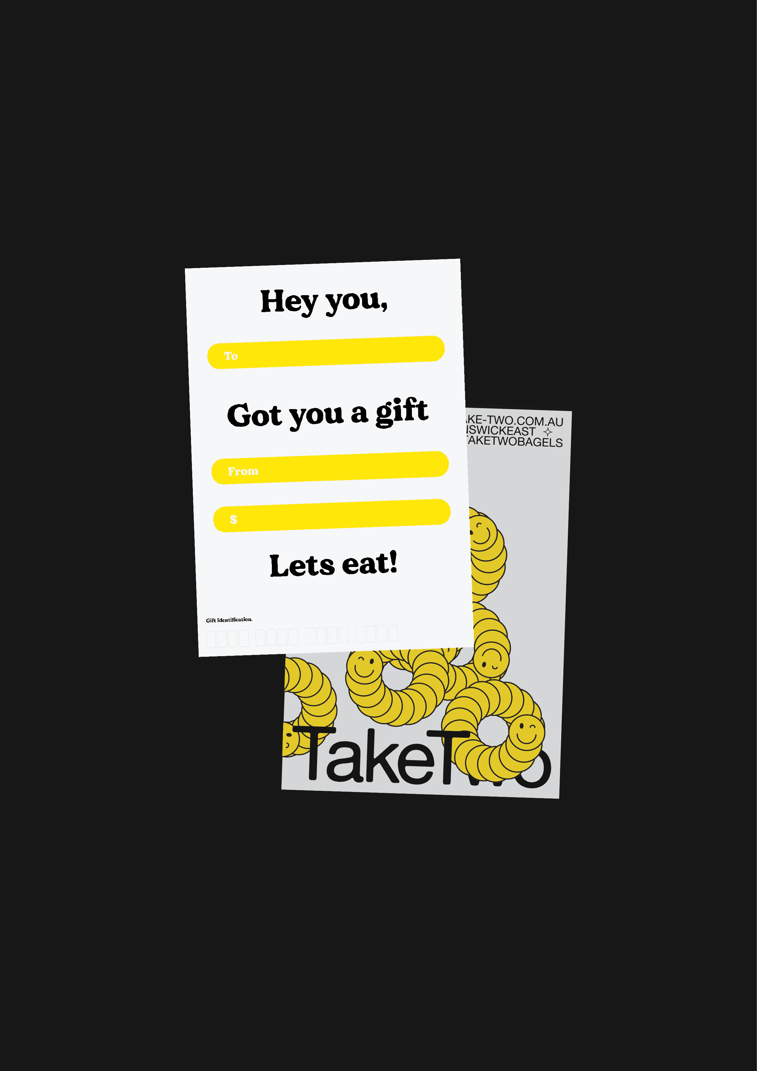
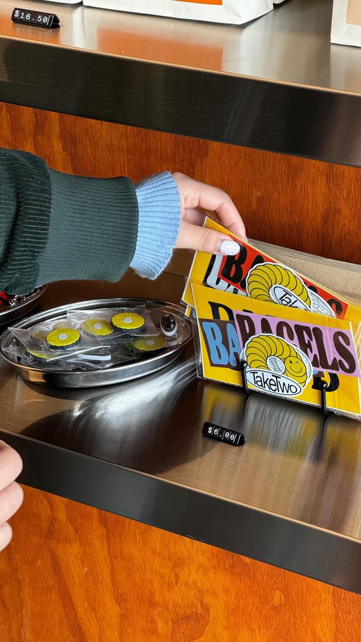
The solution was to build a flexible brand direction centred on bold food imagery, expressive messaging and a strong focus on the bagel offering. The visual system was designed to make the product feel central and appetising, while supporting the wider experience of coffee, service and community. Clean layouts, playful details and consistent brand application helped create a hospitality identity that feels energetic, approachable and recognisable across both digital and physical touchpoints.
Challenge
The challenge was to create a brand direction that captured the warmth and energy of TakeTwo while clearly positioning it as a destination for New York-style bagels. In a competitive hospitality market, the brand needed to feel more distinctive than a standard café, with a visual system that could communicate freshness, flavour and personality across menus, signage, packaging, social content, photography and the website. The identity needed to feel playful and local, while still being clear, consistent and commercially polished.
Solution
The solution was to build a flexible brand direction centred on bold food imagery, expressive messaging and a strong focus on the bagel offering. The visual system was designed to make the product feel central and appetising, while supporting the wider experience of coffee, service and community. Clean layouts, playful details and consistent brand application helped create a hospitality identity that feels energetic, approachable and recognisable across both digital and physical touchpoints.
TakeTwo is a Melbourne bagel shop known for its hand-rolled New York-style bagels, quality coffee and relaxed local energy. Since opening in 2018, the brand has built a strong reputation around fresh food, approachable service and a playful hospitality experience. The project focused on shaping a more distinctive and cohesive brand presence across digital, print and physical touchpoints, translating the personality of the shop into a visual identity that feels casual, memorable and commercially engaging.






Challenge
The challenge was to create a brand direction that captured the warmth and energy of TakeTwo while clearly positioning it as a destination for New York-style bagels. In a competitive hospitality market, the brand needed to feel more distinctive than a standard café, with a visual system that could communicate freshness, flavour and personality across menus, signage, packaging, social content, photography and the website. The identity needed to feel playful and local, while still being clear, consistent and commercially polished.
Solution
The solution was to build a flexible brand direction centred on bold food imagery, expressive messaging and a strong focus on the bagel offering. The visual system was designed to make the product feel central and appetising, while supporting the wider experience of coffee, service and community. Clean layouts, playful details and consistent brand application helped create a hospitality identity that feels energetic, approachable and recognisable across both digital and physical touchpoints.